블로그 이미지
윤영식
Full Stacker, Application Architecter, KnowHow Dispenser and Bike Rider

Publication

Category

Recent Post

2020. 5. 18. 20:23 React/Architecture

Angular v6부터 Web Components에 대한 지원으로 @angular/elements 기능이 추가되어 Custom HTML Tag을 만들 수 있도록 지원한다. 본 글은 해당 사이트의 글Nx.dev 환경과 통합하여 개발하는 과정을 설명한다. Nx 환경은 mono repository 기반으로 multi application을 개발 할 수 있는 환경을 제공한다. Angular/CLI기반이지만 Angular, React, Node.js 개발까지 하나의 Git Repository안에서 개발하고 번들링 할 수 있도록 지원한다. 따라서 micro frontend에서 multi application 개발 잇점을 갖는다. 


블로그 소스 [GitHub]


NX 환경 준비

Angular v9.* 

@angular/cli v9.1.6

RxJS v6.5.*

Typescript v3.8.*

NodeJS v12.16.*

Node Version Manager(nvm)를 통해 로컬환경에 여러 Node버전을 관리하자.

// NodeJS
$ nvm install 12.16.2
$ nvm alias default 12.16.2
$ nvm use 12.16.2

// Angular/CLI 최신버전 사용
$ npm i -g @angular/cli@latest
$ npm i -g @nrwl/cli@latest
$ npm i -g yarn@latest

// local 설치
$ yarn add

NX workspace를 생성한다. 

$ npx create-nx-workspace@latest
// 선택 및 입력
? Workspace name (e.g., org name)     micro-demo
? What to create in the new workspace angular [a workspace with a single Angular application]
? Application name                    app-container
? Default stylesheet format           SASS(.scss)  [ http://sass-lang.com   ]


Web Components 개발 환경 설정

@angular/elements 를 설치한다. 

$ yarn add @angular/elements

UI Component로 ng-antd v9.1.* 를 사용한다. yarn 이 아니라 angular/cli의 'ng' 명령을 사용한다. Yes와 sidemenu 형태 선택한다.

$ ng add ng-zorro-antd

선택하기 
? Enable icon dynamic loading [ Detail: https://ng.ant.design/components/icon/en ] Yes
? Set up custom theme file [ Detail: https://ng.ant.design/docs/customize-theme/en ] Yes
? Choose your locale code: en_US
? Choose template to create project: sidemenu

설치 후에 Nx workspace와 ng-zorro-antd의 불일치를 해결한다.

  • apps/app-container/theme.less의 첫줄의 import 문구 수정
    • @import "../../../node_modules/ng-zorro-antd/ng-zorro-antd.less";
  • apps/app-container/index.html의 root tag 수정
    • <app-root></app-root>

설정 수정후 실행을 하면 sidemenu가 있는 환경이 자동 셋업되어 아래와 같이 보인다. 자세한 설치방법은 사이트를 참조한다.

$ ng serve --open

ng-zorro-antd 자동 적용 화면


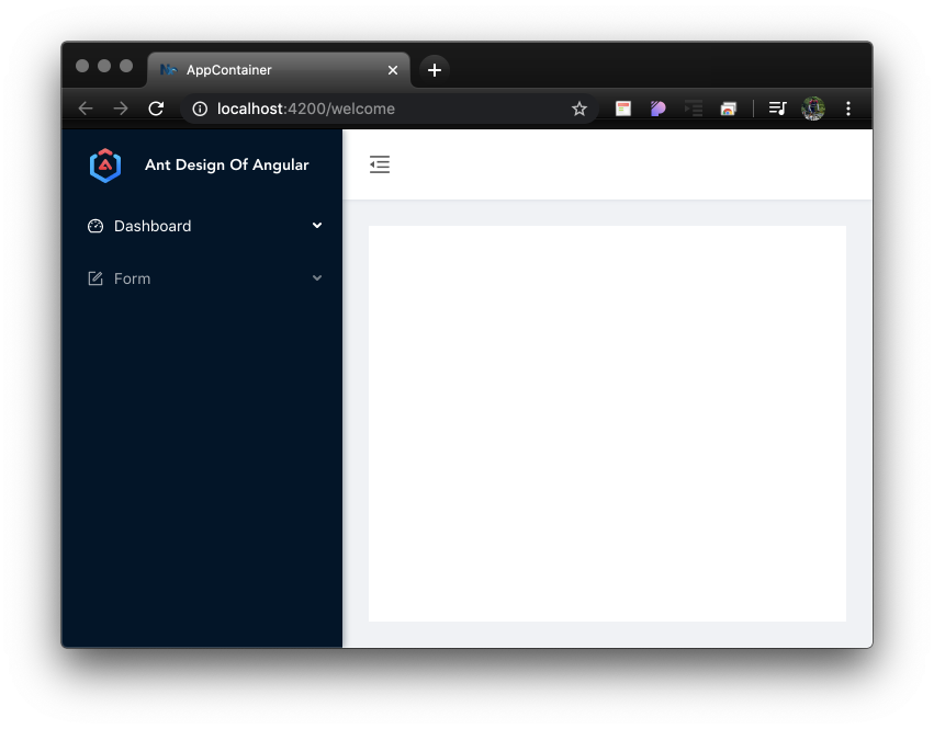
Monitor Web Components 개발 및 번들링


monitor 애플리케이션을 신규 생성한다. 모니터 애플리케이션을 Web Components로 만들어 app-container 애플리케이션에서 동적으로 로딩해 본다. 

$ ng g app monitor

선택
? Which stylesheet format would you like to use? SASS(.scss)  [ http://sass-lang.com   ]
? Would you like to configure routing for this application? No

apps/monitor/src/app/app.component.html과 app.component.ts 를 변경한다. 

// app.component.html
{{title}} Application

// app.component.ts
import { Component, Input } from '@angular/core';

@Component({
  selector: 'micro-demo-root',
  templateUrl: './app.component.html',
  styleUrls: ['./app.component.scss'],
})
export class AppComponent {
  @Input() title = 'monitor';
}

apps/monitor/src/app/app.module.ts에서 Web Comopennts를 등록한다. 

import { BrowserModule } from '@angular/platform-browser';
import { NgModule, Injector } from '@angular/core';
import { createCustomElement } from '@angular/elements';

import { AppComponent } from './app.component';

@NgModule({
  declarations: [AppComponent],
  imports: [BrowserModule],
  providers: [],
  // 동적으로 생성하므로 entryComponents에 등록
  entryComponents: [AppComponent],
  // 정적 bootstrap을 사용하지 않음
  // bootstrap: [AppComponent],
})
export class AppModule {
  constructor(private injector: Injector) {}

  ngDoBootstrap() {
    // createCustomElement를 통해 Web Components 스펙에 맞는 객체로 반환
    const monitorApp = createCustomElement(AppComponent, { injector: this.injector });
    // browser window객체에 잇는 customElements를 통해 Web Components 등록
    customElements.define('monitor-app', monitorApp);
    // 사용방법: @Input() title이 있으므로 attribute 설정가능
    // <monitor-app title="Monitor Application"></monitor-app>
  }
}

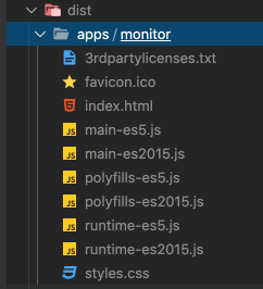
monitor 애플리케이션을 번들링하면 여러개의 파일로 나오는데 번들링 파일을 최소화한다. ngDoBootstrap() 은 정적 bootstrap이 아닌 실행타임에 외부 컴포넌트를 동적으로 로딩할 때 애플케이션 root를 결정할 수 있게 한다. ngDoBootstrap에 대한 설명을 참조하자.

$ ng build monitor --prod --output-hashing=none

수행할 경우 main, polyfill, runtime등의 파일이 생성된다. 파일 최소화를 위해 ngx-build-plus 패키지를 이용한다. 

monitor 애플리케이션의 번들링된 파일들

ng add 명령으로 ngx-build-plus를 설치하고 애플리케이션은 monitor를 지정한다. 

$ ng add ngx-build-plus --project=monitor

ng add 로 수행을 하면 angular.json 파일의 설정을 자동으로 적용해 준다. builder의 명령어를 자동 수정함.

    "monitor": {
      "projectType": "application",
      "schematics": {
        "@nrwl/angular:component": {
          "style": "scss"
        }
      },
      "root": "apps/monitor",
      "sourceRoot": "apps/monitor/src",
      "prefix": "micro-demo",
      "architect": {
        "build": {
          "builder": "ngx-build-plus:browser",  <== builder가 자동 변경됨
          "options": {
          ...
          

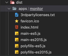
다시 명령으로 monitor 애플리케이션을 번들링한다. ngx-build-plus로 확장한 옵션인 --single-bundle true를 추가한다.

$ ng build monitor --prod --output-hashing=none --single-bundle true

main, polyfill로 압축된 번들링 파일

main과 polyfill을 합쳐주는 스크립트를 등록한다. Mac/Linux기준 명령이다. micro-demo 폴더 밑에 buildSingle.sh 파일을 생성한다. 번들링파일 합치는 명령을 넣는다.  


#!/bin/sh
ng build monitor --prod --output-hashing=none --single-bundle true && cat dist/apps/monitor/main-es5.js dist/apps/monitor/polyfills-es5.js > apps/app-container/src/assets/monitor-es5.js


buildSingle.sh를 수행한 결과 파일은 app-container의 apps/app-container/src/assets/monitor-es5.js 쪽으로 copy된다.


컨테이너 애플리케이션에서 동적로딩

Web Components 스펙을 기준으로 monitor 애플리케이션을 번들링 했기때문에 프레임워크의 종류에 상관없이 <monitor-app> 태그를 사용할 수 있다. 정적으로 사용하는 방법을 살펴보자.


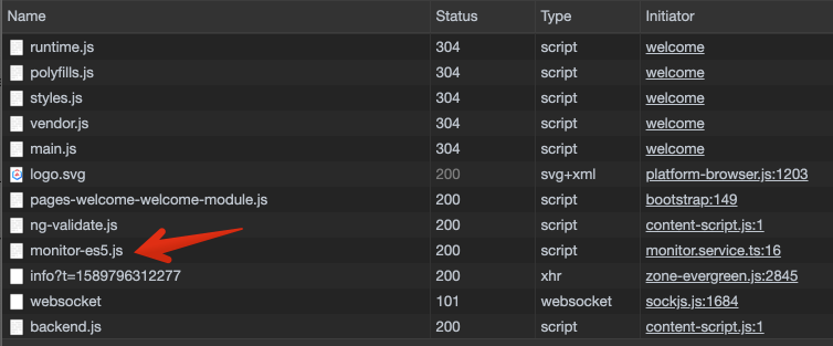
apps/app-container/src/app/pages/welcome/welcome.component.ts에서 monitor-es5.js파일을 import한다. 

import { Component, OnInit } from '@angular/core';
// 소스 import
import '../../../assets/monitor-es5.js';  

@Component({
  selector: 'app-welcome',
  templateUrl: './welcome.component.html',
  styleUrls: ['./welcome.component.scss']
})
export class WelcomeComponent implements OnInit {

  constructor() { }

  ngOnInit() {
  }

}


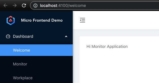
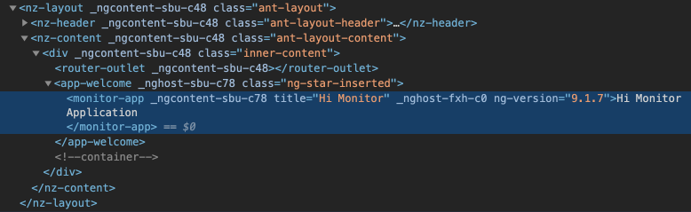
테스트를 위해 welcome.component.html 에 <monitor-app>태그를 설정해 보자. 

<monitor-app title="Hi Monitor"></monitor-app>


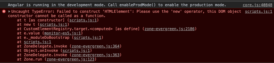
여기까지하고 수행을 하면 <monitor-app> 태그를 해석할 수 없다고 Angular가 에러를 뱃는다. <monitor-app> 은 Angular가 해석하는 것이 아니라 Browser에서 해석되는 Web Components이므로 무시하도록 welcome.module.ts에 CUSTOM_ELEMENTS_SCHEMA를 설정한다. 


import { NgModule, CUSTOM_ELEMENTS_SCHEMA } from '@angular/core';
import { WelcomeRoutingModule } from './welcome-routing.module';
import { WelcomeComponent } from './welcome.component';

@NgModule({
  imports: [WelcomeRoutingModule],
  declarations: [WelcomeComponent],
  schemas: [CUSTOM_ELEMENTS_SCHEMA],
  exports: [WelcomeComponent]
})
export class WelcomeModule { }


설정한 "Hi Monitor"와 함께 <monitor-app>이 출력
브라우져가 해석한 <monitor-app> 태그


<monitor-app>태그를 설정하지 않고 Javascript를 이용하여 로딩해 본다. 

apps/app-container/src/app/monitor.service.ts 파일을 생성한다. 

  • monitor-es5.js 파일 동적 로딩
  • <monitor-app> DOM 동적 추가
import { Injectable } from '@angular/core';

@Injectable({providedIn: 'root'})
export class MonitorLoaderService {
  loaded = false;

  constructor() { }

  // script 동적 로딩
  loadMonitorScript(): void {
    if (this.loaded) {
      return;
    }

    const script = document.createElement('script');
    script.src = 'assets/monitor-es5.js';
    document.body.appendChild(script);
    this.loaded = true;
  }

  // <monitor-app> 태그 추가
  addMonitorApp(): void {
    const tile = document.createElement('monitor-app');
    // @Input() 내용은 setAttribute로 추가 가능
    tile.setAttribute('title', 'Dynamic Load Monitor');

    const content = document.getElementById('content');
    content.appendChild(tile);
  }
}


 위의 경우 monitor-es5.js 파일을 별도로 다운로드받아 동적 로딩을 수행한다. 

monitor-es5.js 파일을 <script> 태그 추가후 동적으로 다운로드 받음


공통 파일 빼고 번들링하기

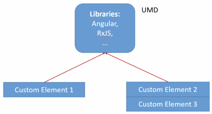
만일 app-container과 monitor 에서 사용하는 공통 패키지의 버전이 같다면, app-container 애플리케이션과 monitor 애플리케이션이 공통으로 사용하는 파일중, monitor 애플리케이션을 번들링할 때 공통파일을 제거하는 방법에 대해 알아보자. 제거를 통해 monitor 애플리케이션의 번들링 사이즈를 줄일 수 있다. 이는 Network payload time을 줄여주는 결과를 갖는다. 


ngx-build-plus를 이용해서 @angular/cli의 webpack externals 을 자동 생성한다. (참조)

$ ng g ngx-build-plus:externals --project monitor

수행을 하면 angular.json 파일에 별도 환경이 추가되고, apps/monitor/webpack.externals.js 파일이 생성된다. angular.json 내용중

"node_modules/@angular/elements/bundles/elements.umd.js", 내용은 제거한다. elements.umd.js를 공통파일로 빼서 사용하는데 오류가 있다. 

elements.umd.js 를 포함시킬 경우 오류가 발생함

angular.json의 monitor 애플리케이션으 "scripts" 설정 내역 => scripts.js 파일에 설정한 *.umd.js 파일을 합친다.

// angular.json 내의 monitor 애플리케이션 설정
// "scripts"에 externals로 참조하는 파일 설정이 자동으로 입력되어 진다.
    "monitor": {
      "projectType": "application",
      "schematics": {
        "@nrwl/angular:component": {
          "style": "scss"
        }
      },
      "root": "apps/monitor",
      "sourceRoot": "apps/monitor/src",
      "prefix": "micro-demo",
      "architect": {
        "build": {
          "builder": "ngx-build-plus:browser",
          "options": {
            "outputPath": "dist/apps/monitor",
            "index": "apps/monitor/src/index.html",
            "main": "apps/monitor/src/main.ts",
            "polyfills": "apps/monitor/src/polyfills.ts",
            "tsConfig": "apps/monitor/tsconfig.app.json",
            "aot": true,
            "assets": [
              "apps/monitor/src/favicon.ico",
              "apps/monitor/src/assets"
            ],
            "styles": [
              "apps/monitor/src/styles.scss"
            ],
            "scripts": [
              "node_modules/rxjs/bundles/rxjs.umd.js",
              "node_modules/@angular/core/bundles/core.umd.js",
              "node_modules/@angular/common/bundles/common.umd.js",
              "node_modules/@angular/common/bundles/common-http.umd.js",
              "node_modules/@angular/compiler/bundles/compiler.umd.js",
              "node_modules/@angular/elements/bundles/elements.umd.js", // <-- 제거한다
              "node_modules/@angular/platform-browser/bundles/platform-browser.umd.js",
              "node_modules/@angular/platform-browser-dynamic/bundles/platform-browser-dynamic.umd.js"
            ]
          },

apps/monitor/webpack.externals.js  파일내역에서 ng.elements도 주석처리한다.  => monitor-es5.js 파일에서 제거되는 파일목록이다.

const webpack = require('webpack');

module.exports = {
    "externals": {
        "rxjs": "rxjs",
        "@angular/core": "ng.core",
        "@angular/common": "ng.common",
        "@angular/common/http": "ng.common.http",
        "@angular/platform-browser": "ng.platformBrowser",
        "@angular/platform-browser-dynamic": "ng.platformBrowserDynamic",
        "@angular/compiler": "ng.compiler",
        // "@angular/elements": "ng.elements",  <-- 주석처리한다.

        // Uncomment and add to scripts in angular.json if needed
        // "@angular/router": "ng.router",
        // "@angular/forms": "ng.forms"
    }
}

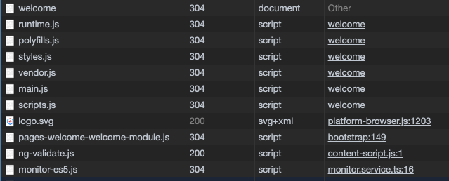
buildSingle.sh 내용을 수정한다. scripts.js 파일은 window.ng.core 또는 window.ng.common과 같은 global 객체가 담겨있는 파일이다. 따라서 scripts.js는 app-container 애플리케이션에서 최초 한번만 로딩하면 되고, 이후 monitor 애플리케이션과 같은 web components는 번들 파일은 자신의 내용만을 포함한다.


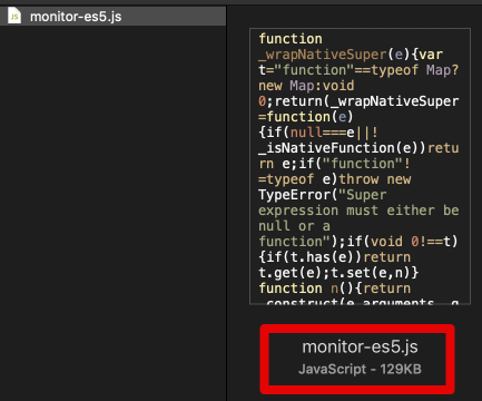
monitor app size including common library  - 129KB

common library를 포함한 사이즈 - 129KB

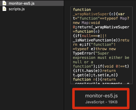
monitor app size excluding common library - 19KB

monitor app과 @angular/elements만 포함한 사이즈 - 19KB

#!/bin/sh
ng build monitor --prod --extra-webpack-config=apps/monitor/webpack.externals.js --output-hashing=none --single-bundle true && cat dist/apps/monitor/main-es5.js dist/apps/monitor/polyfill-es5.js > apps/app-container/src/assets/monitor-es5.js
cat dist/apps/monitor/scripts.js > apps/app-container/src/assets/scripts.js

scripts.js 파일은 angular.json 의 app-container 애플리케이션 "scripts" 옵션에 추가한다. 

    "app-container": {
      "projectType": "application",
      "schematics": {
        "@nrwl/angular:component": {
          "style": "scss"
        }
      },
      "root": "apps/app-container",
      "sourceRoot": "apps/app-container/src",
      "prefix": "micro-demo",
      "architect": {
        "build": {
          "builder": "@angular-devkit/build-angular:browser",
          "options": {
            "outputPath": "dist/apps/app-container",
            "index": "apps/app-container/src/index.html",
            "main": "apps/app-container/src/main.ts",
            "polyfills": "apps/app-container/src/polyfills.ts",
            "tsConfig": "apps/app-container/tsconfig.app.json",
            "aot": true,
            "assets": [
              "apps/app-container/src/favicon.ico",
              "apps/app-container/src/assets",
              {
                "glob": "**/*",
                "input": "./node_modules/@ant-design/icons-angular/src/inline-svg/",
                "output": "/assets/"
              }
            ],
            "styles": [
              "apps/app-container/src/theme.less",
              "apps/app-container/src/styles.scss"
            ],
            "scripts": [
              "apps/app-container/src/assets/scripts.js"  <== 추가
            ]
          },

수행하면 네트워크에서 scripts.js 파일은 한번만 로딩되고, 이후 다양한 Web Components들은 자신의 애플리케이션 내역만 포함한 파일로 번들링하여 파일 사이즈를 줄일 수 있다. (참조)

Custom Element에서 common library를 window객체쪽으로 변경함.


scripts.js 로딩 후 monitor-es5.js 파일 로딩


참조

https://www.angulararchitects.io/aktuelles/angular-elements-part-i/


Angular Elements, Part I - ANGULARarchitects

A dynamic dashboard in four steps with Web Components

www.angulararchitects.io

https://ng.ant.design/docs/getting-started/en


NG-ZORRO - Ant Design Of Angular

An enterprise-class UI design language and Angular-based implementation with a set of high-quality Angular components, one of best Angular UI library for enterprises

ng.ant.design

https://medium.com/angular-in-depth/how-to-manually-bootstrap-an-angular-application-9a36ccf86429


How to manually bootstrap an Angular application

AngularInDepth is moving away from Medium. This article, its updates and more recent articles are hosted on the new platform inDepth.dev

medium.com

https://www.angulararchitects.io/aktuelles/your-options-for-building-angular-elements/


Your options for building Angular Elements - ANGULARarchitects

with the CLI

www.angulararchitects.io

https://indepth.dev/tiny-angular-application-projects-in-nx-workspaces/


Tiny Angular application projects in Nx workspaces

Use assets, styles, and environments workspace libraries to follow the Single Responsibility Principle. Step-by-step commands and instructions.

indepth.dev

https://nstudio.io/blog/custom-web-elements-with-angular-and-react


nstudio | Custom web elements for Angular and React with Nx + xplat

Passionate about implementing creative solutions for you. Technology, Consulting, Audio/Video Production. Web/Mobile apps, Angular/NativeScript plugins, Vue/NativeScript, product development, team training and help with project features/objectives.

nstudio.io


posted by 윤영식
2016. 1. 12. 07:51 Angular/Prototyping

이번에는 앵귤러 컴포넌트가 어떻게 웹 컴포넌트가 될 수 있는지 보자. 본 내용은 앵귤러 2의 디자인 가이드 중 Web Components에 대한 내용을 바탕으로 한다. (디자인 문서는 초기 버전이고 최신 버전의 변경분 반영이 안될 수 있다. 말 그대로 초기 생각의 흔적으로만 보고, 정의한 것들이 확정되었다곤 생각하지 말자. 따라서 변경된 내역도 나중에 찾아 보아야 한다)


Angular Component as a Web Components 


Angular Component가 Web Components가 되기위한 기본은 events, properties와 자바스크립트나 타 프레임워크에서 접근가능하고 Web Components에 적용되는 methods(API)를 갖는 DOM element를 만드는 것이다. Template 디자인 가이드에 나온 아래 그림을 보면 Template을 갖는 Component Directive로 만들면 Web Components로 Export할 수 있고, Import할 수 있다. 


Publishing events, properties, methods


앵귤러로 컴포넌트를 만들어 보자.

@ComponentDirective({

  selector: 'x-zippy'

  template: ...

})

class ZippyComponent {

  constructor(events) {

    this.events;

  }


  @Property('title')

  get title() ...;

  set title(value) ...;


  @Property('isOpen')

  get isOpen() ...;

  set isOpen(value) {

    if (value != this.isOpen) this.toggle();

  }


  @Publish('open')

  open() {

    this.isOpen = truefalse;

    this.events.fire('open');

  }


  @Publish('close')

  close() {

    this.isOpen = falsetrue;

    this.events.fire('close');

  }


  @Publish('toggle')

  toggle() {

    value ? close() : open();

  }

}


@Proptery 와 @Publish 에노테이션을 통해 앵귤러가 앵귤러 프레임워크없이도 엘러먼트 자체에 접근할 수 있는 properties/methods를 노출하고 있다. 사용예는 다음과 같다.

<x-zippy title="Hi YoungSik">

   Some thing...

</x-zippy>


native 엘러먼트처럼 사용되어 지는 컴포넌트가 되기위해 다음과 같이 동작해야 한다. 

var tab = _lookup_custom_element;

var log = null;

tab.addEventListener('open', function() { log = 'open'; })

tab.addEventListener('close', function() { log = 'close'; })


tab.close();

expect(tab.isOpen).toEqual(false);

expect(log).toEqual('close');


tab.toggle();

expect(tab.isOpen).toEqual(true);

expect(log).toEqual('open');  


Custom Element 등록하기(Registering)


Angular Component가 Web Components가 되기 위한 마지막은 앵귤러의 스크프밖에서 인스턴스화 할 수 있어야 한다. 이를 위한 기본 생각은 다음과 같이 Angular가 customElementFactory를 registerElement API를 통해 등록하는 방식이다. 

var injector = angular.createInjector(setOfModules);

var customElementFactory = injector.get(CustomElementFactory);

var Greeter = customElementFactory(GreeterDirective);

document.registerElement('x-greeter', { prototype: Greeter });


var div = document.createElement('div');

div.innerHTML = '<greeter>'; // trigger internal DOM parser.

var greeter = div.firstChild; // retrieve the greeter


// Notice that we are now instance of Greeter

expect(greeter instanceOf Greeter).toBe(true);


// Notice that it can be used just like any other DOM Element

greeter.name = 'world';

greeter.greet();


이후 디자인 가이드 내용이 갑작이 끝나버린 관계로 다른 문서들을 뒤적여 보기로 한다.   To be continued...


<참조>

  - Web Components 디자인 가이드 


posted by 윤영식
2016. 1. 11. 07:58 Angular/Prototyping


앞으로의 Web App 개발은 Component기반 개발 방식으로 진행될 가능성이 높다. 아니 그렇게 될 것으로 보인다. 왜냐하면 표준 제정 기구와 기업이 원하고 그안에서 일하는 개발자들이 원한다. 여기서 기구는 W3C에서 스펙작업을 하고 있고, 기업은 구글형님이 열심히 삽질하며 진행을 하고 있다. 역시 삽질 내공은 구글이 참 잘 하는것 같다. 돈이 많아서 그런다기 보다는 미래의 먹거리를 위해 열심히 뛰는 양상이다. 


애플은 여기서 한발 물러나 있다. 그들의 주 수입은 하드웨어판매와 플랫폼에서 발생하는데, 여기서 말하는 플랫폼은 iOS 장터에서 거래되는 대부분의 수익이 Native App에서 발생한다. 따라서 굳이 Web에 열심히 힘쏫을 필요가 없다는 이야기다. 애플이 그냥 조금씩 서두리지 않고 곁눈질만 하는 놈이라면 구글은 광고로 돈을 벌고 그 광고는 웹에서 발생하니 웹의 외연 확장을 위해 Web Components는 중요한 기술로 생각한다. 그래서 열심히 3년전부터 구글 I/O를 통해 Polymer의 진행상황을 공유하고 있고, 꾸준히 삽질해 주면서 업계를 리딩할 것으로 보인다. 


"Web Components는 웹상(DOM/CSS 렌더링 엔진이 탑재된 모든 것)에서 Native Element와 같은 지위를 얻어 컴포넌트 기반 개발을 가능케 하는 핵심 스펙이다." 


라고 나는 생각한다. 기존 브라우저에서는 기본 정의된 Tag들만 해석을 할 수 있지만, 얼마든지 내가 만든 컴포넌트가 브라우저가 Native하게 해석을 해준다면... 그러니 Native 엘러먼트가 되면 Angular, Ember, React, Knockout 같은 프레임워크나 라이브러리 컴포넌트와 자연스럽게 붙여서 상호작용토록 사용할 수 있지 않겠는가? 앵귤러를 예로 들면 AngularJS v1.* 에서 Web Components와 엮어서 써볼려는 눈물겨운 노력도 있었지만 말 그대로 그냥 시도라고 보자. 근데 이상한 것은 Angular 도 구글! Web Components의 Polyfill 라이브러리인 Polymer도 구글! Future Web App Developments 방향이 Component based Development이니 Angular 프레임워크도 이 방향으로 새롭게 갱생할 필요를 느꼈을 것이다. 그래서 2년전부터 열심히 개발중인 Angular v2.* 에서 Web Components와 함께 쓸 수 있는 방향을 정의했다. 


무엇이라고 이야기하는지 보자.

allow Angular to consume any Web Components without resorting to some Angular unique APIs and or conventions. (Proposal for other frameworks require that component be aware of framework specific API )

  웹 컴포넌트가 네이티브로 인지 되면서 자연스럽게 Angular가 웹 컴포넌트를 소비할 수 있을 것이다. 이를 위해 Angular가 장치를 마련해 두려고 노력을 하고 있고, Misko가 컨퍼런스에서 이야기 하고 있다. 


- allow Angular components to be packaged as Web Components and be used in other frameworks or in vanilla JavaScript.

  앵귤러 컴포넌트가 웹 컴포넌트로도 패키지 된다. 


ng-conf 2015에서 미스코가 말한 Angular1에서 Angular2로 가면서 Syntax 표현이 바뀌게 된 이유와 Web Components를 어떻게 Angular2와 결합해 사용할 수 있는지 설명한다. 좀 박수를 쳐주고 싶다. 놀라울 따름... 잘 모르겠으면 아래의 디자인 가이드를 보자. 


Custom Element Interface


브라우저가 제공하는 엘러먼트와 Custom 엘러먼트는 구분을 하지 않고 모든 것을 DOM element로 보는 것이 웹 컴포넌트임을 전제로 한다. DOM element의 API 구성은 다음과 같다.


  - DOM events

  - DOM attributes 

  - Element properties 

  - Element methods 


DOM은 Domcument Object Model의 약어이고 이는 HTML/XML을 객체로 변화하고 객체 안에 어떤 API가 있어야 하는지 정의해 놓았다. 일단 모든 DOM의 최상위 인터페이스는 Node이고 하위로 크게 3가지인 Document, Element, Text가 존재한다. Custom element API는 events, attributes, properties, methods를 갖는다고 볼 수 있고 해당 엘러먼트에 대해서 두가지 관점으로 접근한다면 "사용하는 입장(Consumer)"과 "엘러먼트는 구현하는(implementer) 입장"이 있다. 먼저 엘러먼트 접근 사용하는 경우를 보자. 


Interface Consumer


접근해서 사용하는 입장의 4가지 경우. 여기서 native와 custom element간의 접근/사용에 대한 방법상의 차이는 전혀 존재하지 않는다.

var element = ... // element를 얻어온다


// DOM attributes

element.setAttribute('title', 'hi dowon');


// DOM event

element.addEventListener('change', ...);


// Element property 

element.value = 'youngsik';


// Element method 

element.focus();


Interface Implementer


Element를 구현하는 입장은 Custom Element를 만드는 것이고 Native element와 동일한 위치를 부여 받도록 Web Components 스펙을 제정한 것이다. 이때 구현을 위해 필요하는 영역으로 크게 4가지가 있다. 


  - Custom Element

     엘러먼트를 어떻게 만들지 API를 정의한다. 

     HTMLElement.prototype을 확장한다


  - HTML Templates

    엘러먼트의 내용을 Out of Box로 분리해서 만드는 방법을 정의한다. 

    <template id="my-element"> 태그안에 정의


  - HTML imports

    템플릿의 확장자는 .html이고 이를 import하는 방법을 정의한다. 비동기적 import. 

    <link rel="import" href="my-element.html"> 


  - Shadow DOM

    템플릿을 import한 후 사용하는 방법을 정의한다. Out of Box로 JS, CSS를 격리(Boundary)한다. 

    Document 노드 밑에 Root Node는 HTML 이듯이 Custom Element 밑의 Root 는 Shadow Root (Node)이다. 

    var shadow = node.createShadowRoot(); 처럼 Component안에서 Root Node 역할을 하는 Shadow Root Node를 생성한다. 


DOM Elements and Data-binding Frameworks


Custom Element와 앵귤러와 같은 프레임워크간에 데이터 바인딩을 위해 별도의 규칙을 강제하면 안된다. 이러한 문제를 프레임워크에서 해결을 해야한다. 데이터 바인딩에는 두가지 방향이 있다. 


  - 엘러먼트에 데이터 쓰기

     native 엘러먼트에 있는 API를 사용해 property 또는 attribute에 접근한다.  


  - 엘러먼트에서 데이터 읽기 

    항시 property를 읽어온다. attribute는 tag 에 표현되는 정적이 값으로 최초에 설정되고 그 이후 바뀌지 않고 tag가 DOM tree안의 Object 변경되어 property를 접근할 수 있다. 또한 attribute는 변경이 안되지만 property는 변경이 가능하다. 


앵귤러에서 이러한 property 변경을 감지하기 위해 Change Detection 이 필요하다. 일단 변경하는 방법은 엘러먼트의 속성(property)를 통해 아래와 같이 가능하다. 

// element 얻어오기 

var input = ...;


// 변경이 감지되었을 때 element의 property를 통해 변경을 수행

input.value = newValue;


그렇다면 변경의 감지는 어떻게 할까? 프레임워크도 DOM events를 이용해서 아래와 같이 감지하는 방법이 필요하다. 

var input = ...;


// 프레임워크가 input event를 등록한다. 

imput.addEventListener('input', () { 

   // 값을 읽어온다. 

   var newValue = input.value;


  // 변경 감지 시스템에 알려준다. 

  framework.notify(input.value);

});


그럼 Web Components 스펙으로 작성된 엘러먼트의 내부 상태 정보의 변경을 어떻게 Detection할까? 이에 대해 Web Components에는 스펙이 없다. 따라서 native element의 기존 이벤트를 적절히 사용해야 한다. 


Angular and Web Components


앵귤러가 Custom 엘러먼트를 어떻게 사용하는지 프롬프트 창에 텍스트를 입력하는 Web Components 예제를 통해 알아보자.


프롬프트 API 


  - Element properties 종류 

    + title: 다이얼로그 타이틀 텍스트

    + content: 사용자가 타이틀을 수정하면 반영될 property. 컴포넌트는 edited 이벤트 발생 

    + visible: 다이얼로그가 보이면 true, visible의 변경에 따라 open/closed 이벤트 발생


  - Element methods 종류 

    + open()

    + close()


  - DOM Attributes

    + accept-text: accept 버튼에 보여지는 텍스트

    + cancel-text: cancel 버튼에 보여지는 텍스트 


  - DOM Events 

    + accepted: accept 버튼을 클릭하면 발생하는 이벤트 

    + canceled: cancel 버튼을 클릭하면 발생하는 이벤트 

    + open: 다이얼로그 박스가 오픈하면 발생하는 이벤트

    + close: 다이얼로그 박스가 닫히면 발생하는 이벤트 

    + edited: 다이얼로그박스에 텍스트 입력할 때 발생하는 이벤트 


var Prompt = Object.create(HTMLElement.proptype, {

  // property 정의

  title: { get: function() {...}, set: function(value) {...}},

  content: { get: function() {...}, set: function(value) {...}},

  visible: { get: function() {...}, set: function(value) {...}},


  // attribute notification 정의 

  attributedChangedCallback(name, old, new) {...},


  // methods 정의

  open: function() {...},

  close: function() {...} 

});


document.registerElement('x-prompt', { prototype: Prompt });


Web Components 인스턴스 만들기


커스텀 엘러먼트로 사용하기 위해 registerElement를 해서 Web Component로 등록을 하면 이름을 통해 언제나 DOM Element를 인스턴화할 수 있다. 아래 보는 것처럼 앵귤러에서 사용하기 위해 앵귤러에서 추가 조치로 해야할 것이 없다. 

<div ng-repeat="item in items">

  <x-prompt></x-prompt>

</div>


이벤트 리스닝(Listening)


Custom Element가 자신의 open 이벤트를 발생시키면 Angular에서 리슨(Listen)할 수 있어야 한다. Angular 1에서는 ng-click같은 디렉티브가 설정되어 있어야 리슨을 할 수 있었다. 즉, 버전 1 로 하면 open 이벤트에 대한 디렉티브가 있어야 한다는 소리이다. 그래서 Angular 2는 디렉티브 없이 on-*을 붙이면 커스텀 이벤트도 리슨할 수 있게 제안하고 있다. (위에 ng-conf 2015에서 미스코가 후반부에 Web Components 사용예를 보면 (close)="doSomething()" 으로 처리한다. 예제)

<x-prompt on-close="doSomething()">


Attributes/Properties에 expression 바인딩하기 


앵귤러 데이터 바인딩은 expression이 변경되면 연결된 destination 값도 자동으로 바뀌게 한다. 앵귤러는 attribute 또는 property에 변경된 값이 쓰여지는 것을(be written) 알아야 한다. 실험적으로(heuristic) 아래와 이를 찾아낸다.

function updateValue(element, name, value) {

  // register에서 행위를 찾는다

  var useProperty = checkOverrides(element, name);

  if(useProperty == null) {

    // use heuristic

    useProperty = name in element;

  }

  if(useProperty) {

    element[name] = value;

  } else {

    element.setAttribute(name, value);

  }

}


위의 방법으로 다음을 해석해 보면

<x-prompt accept-text="I {{name}} accept" 

                   cancel-text="Cancel"

                   bind-title="contract.name">


  - cancel-text="Cancel"; 은 cancel-text Attribute 값으로 "Cancel" 문자를 updateValue(element, 'cancel-text', 'Cancel');로 호출한다. 

  - accept-text="I {{name}} accept"; 도 accept-text Attribute 값으로 expression을 문자로 변화하여 updateValue(element, 'accept-text', 'I ' + name + ' accept'); 로 호출한다. 

  - bind-title="contract.name"; 은 양방향 바인딩으로 엘러먼트의 title 프로퍼티와 contract.name이 맵핑어 expression이 바뀌면 title 프로퍼티도 업데이트 되어진다. 


Web Components 얻


최신 소스를 보면(ng-conf 2015의 youtube 예제) 다음과 같이 나온다. (앵귤러 디자인 가이드 문서를 보면 역시 글로 쓰여진 것의 업데이트하기는 거기나 여기나 비슷한가 보다. 써놓고 신경을 쓰지 않으면 업데이트 하기가 힘들어서 초기의 생각의 흔적만을 볼 수 있고, 변경된 최신 내역을 볼 수가 없다. 여기서도 마찬가지다)

<google-youtube chromeless="0"

   #player

   [videoid]="video.id"

   (googleyoutubestatechange)="setState($event.detail.data)">

</google-youtube>

<button *ng-if="!isPlaying()" class="md-button md-default-theme md-raised"

      (click)="player.play()">Play

</button>

<button *ng-if="isPlaying()" class="md-button md-default-theme md-raised"

      (click)="player.pause()">Pause

</button>


  - 일단 google-youtube Web Components에 #player 로컬 변수를 선언하고 Button 태그에서 사용을 하고 있다. 

  - (click)="player.play()" 또는 (click)="player.pause()"를 호출하고 있다. 

  - 디자인 문서에 따르면 on-click="player.play()" 그리고 ng-id="player", bind-videoid="video.id"와 같이 표현을 해야할 것이다. 어떻게 하든 많은논의를 통해 디자인에서 이야기 내용이 좀 더 발전적으로 변경된 모습을 볼 수 있다. 


엘러먼트의 property/attribute 발견하기(Detecting)


커스텀 엘러먼트는 DOM attributes와 Element property를 변경할 수 있다. DOM attributes는 DOM4의 DOM Mutation Observers를 이용해 찾을 수 있지만 Javascript나 DOM API를 이용해 Element property의 변경을 발견하는 것은 쉽지않다. 그래서 앵귤러는 실험적(heuristic)으로 컴포넌트의 이벤트를 찾아 리스닝(Listening)을 하고 변경이 발생하면 컴포넌트에 대해서만 dirty checking을 하여 변경을 반영함으로 부정적인 성능 저하를 제거한다. (즉, 해당 엘러먼트의 이벤트를 찾아 리스닝을 걸어 놓는 방법은 Native에서 많이 사용하는 방법이고 이를 그대로 활용한다. Angular 1에서는 dirty checking이 모든 $scope의 변경을 체크했다면 이제는 컴포넌트 변경안에서만 dirty checking이 일어아는 샘이다)


다음 장에서는 앵귤러 컴포넌트가 어떻게 웹 컴포넌트가 될 수 있는지 알아본다.


<참조> 

  - Angular v2.* 의 Web Components 관계 정립 문서  

  - Web Components 소개 

  - Angular + Web Components 사용 youtube 예제 소스 (ng-conf 2015)


posted by 윤영식
2015. 1. 3. 19:25 Angular/Prototyping

구글 폴리머기반으로 자신만의 Web Components 를 만들어 보자. 아주 초간단 웹 컴포넌트이지만 기반 컴포넌트를 설치하고 어떻게 구동되는지 손으로 익혀본다. 


설치하기 


  - 폴러머를 시작하기 위해 zip파일을 받을 수 있지만 클라이언트 컴포넌트 의존관리 툴이 바우어(Bower)를 사용한다. 

     바우어는 노드(Node.js)기반위에 돌ㄹ아가기 때문에 노드를 설치하고 바우어도 설치한다. 

  - 바우어를 통해 프로젝트를 초기화 해보자. bower init 후에 그냥 끝날 때가지 엔터를 친다. bower.json 환경파일이 생성된다. 

$ mkdir tutorial && cd tutorial

$ bower init 


  - 폴리머를 설치한다. polymer.js 는 Web Components를 지원하기 위한 polyfill 파일인 webcomponents.js 파일도 포함한다. 

    + polyfill은 Web Components 스팩을 지원하지 않는 브라우져에서도 Web Components를 사용할 수 있도록 해주는 파일이다. 

       따라서 과거 브라우져는 webcomponents.js (과거는 platform.js였음) 파일을 추가해야 한다. 

     + Chrome 36+ 이상 버전은 Web Components 스팩이 구현되어 있기 때문에 polyfill 파일이 필요없다. 

$ bower install --save Polymer/polymer


처음 만들어 보는 웹 컴포넌트 


  - 웹컴포넌트를 만든 후 html안에서 사용한다. 

  - 먼저 폴리머 웹 컴포넌트를 정의한다. 

    + 폴리머 엘러먼트를 사용하기 위해 polymer.html을 추가한다. 

    + 사용자 정의 웹컴포넌트 이름은 hi-dowon이다. 구분은 "-" 을 꼭 사용한다. 

    + html에서 사용할 때 public으로 노출 시킬 attribute로 name을 지정한다. 

    + <template>와 <script>에서 상호 작용한다. 스크립트 태그에 지정한 값이 template 쪽으로 {{}} 사용해 양방향 바인딩 된다. 

tutorial> mkdir elements && cd elements

tutorial/elements> vi hi-dowon.html 


// hi-dowon.html 내용 

<link rel="import" href="../bower_components/polymer/polymer.html">


<polymer-element name="hi-dowon" attributes="name">

  <template>

    <span> This is <b>hi-<span style="color: {{color}}">{{owner}}</span></b> tag <br>

    <span> And hi {{name}}</span><br>

    <input id="message" value="{{name}}">

    <button on-click="{{setFocus}}">Set Focus in name input</button>

  </template>

  <script>

    Polymer({

      owner: 'Dowon',

      color: 'red',

      name: 'youngsik',

      setFocus: function() {

        this.$.message.focus();

      }

    })

  </script>

</polymer-element>


  - 이제 elements/hi-dowon.html 파일을 사용하는 index.html 파일을 작성한다. 

    + 웹 컴포넌트는 HTML imported를 통해 사용하고자 하는 웹컴포넌트를 조합(Composition)해 확장(Scale-out)하는 방식이다. 

    + 모던 브라우져가 아닌 구버전의 브라우져에서 웹컴포넌트 스펙지원을 위해 polyfill파일인 webcomponents.js 파일추가한다. 

       Chrome 36+ 이상 버전은 polyfill 설정이 필요없다. 

<!DOCTYPE html>

<html>

    <head>

        <script src="bower_components/webcomponentsjs/webcomponents.min.js"></script>

        <link rel="import" href="./elements/hi-dowon.html">

    </head>

    <body>

        <hi-dowon name="ok"></hi-dowon>

    </body>

</html>


  - 결과 수행

    + 파이썬의 심플 서버를 뛰어서 호출해 본다. 

tutorial> python -m SimpleHTTPServer 8000


// 결과 화면 : 버튼을 클릭하면 포커스이동 


  - 폴리머의 레이어는 3계층으로 나뉜다 

    1) Web Components : Web Components 스팩을 지원하지 않는 브라우져를 위한 web components polyfill 레이어 

    2) Polymer 라이브러리 : 사용자 정의 엘러먼트(Custom element)를 위한 선언적 신택스를 제공

    3) Elements :Core 와 Paper element와 같이 기정의된 웹 컴포넌트 제공. 


1. Polymer에서 Custom Elements


  - Custom Element is True Element. 사용자 정의 엘러먼트를 사용하는 이유를 보자.

  • Reduce the amount of code you have to write. : 누군가 만들어 놓은 엘러먼트가 있다면 Don't invent한다. 
  • Express the function of the code. : 
  • Encapsulate internal details. : 코드 내부를 캡슐화 할 수 있다 
  • Implement APIs per element type. : 엘러먼트별 API가 있고 애트리뷰트로 접근한다. 
  • Increase productivity by letting you reuse elements. : 엘러먼트를 조합해서 생산성을 높일 수 있다. 
  • Use inheritance to create element tags based on other tags. : extends 키워들 통해 custom element를 확장할 수 잇다


  - 웹 컴포넌트의 Custom Element는 다음과 같이 작성을 해야하지만 폴리머를 쓰면 단순히 <polymer-element> 태그를 사용하면 끝!

    + Customer Element 명칭을 지을 땐 반드시 "-"이 있어야 한다. (polymer element 선언 참조)

// 코딩 

var myTag = document.registerElement('my-tag');


// 선언적 태깅 

<polymer-element name="my-tag">

  <template> 

    <div> hello dowon </div> 

  </template>

  <script>

     Polmer();

  </script>

</polymer-element>


  - extends 키워드를 통해 기존 엘러먼트를 확장할수 있고, 부모의 메소드와 속성을 자식 엘러먼트가 상속받는다. 

    또한 오버라이딩도 가능한다. 

  - 엘러먼트 종류로 UI 렌더링되는 엘러먼트와 No-UI 엘러먼트를 만들 수 있다. 예로 <core-ajax>은 XHR 요청을 마크업으로 할 수 있게 한다. 

<core-ajax url="http://gdata.youtube.com/feeds/api/videos/" auto params='{"alt":"json", "q":"chrome"}' handleAs="json"></core-ajax>

<script>

  var ajax = document.querySelector('core-ajax');

  ajax.addEventListener('core-response', function(e) {

    console.log(this.response);

  });

</script>


2. Polymer에서 Shadow DOM


  - 프로그램적으로 Shadow DOM을 하려면 createShadowRoot를 넣어야 하지만 Polymer에서는 <template> 태그를 사용한다. 

    + <span> <content> <footer>는 다른 커스텀 엘러먼트안에 있을 때 완전 캡슐화되어 숨겨진다는 것을 명심하자. 

<polymer-element name="my-custom-element" noscript>

  <template>

    <span>People say: </span>

      <content select="qq"></content> 

    <footer>sometimes</footer>

  </template>

</polymer-element>


  - DOM은 3가지가 있다. Light DOM, Shadow DOM, Composed DOM

     + Light DOM : 하기와 같이 my-custom-element 안에 <qq> Hi dowon </qq>로 포함된 DOM 이다. innerHTML로 접근이 가능하다.  

<my-custom-element>

  <qq> Hi dowon </qq>

</my-custom-element>


    + Shadow DOM : <polymer-element> 태그 안에 <template> ... </template> 태그안에 정의된 DOM 이다. 

       DevTools에서는 #docuement-fragment로 표기되고 사용자에게 숨겨져있고, <my-custom-element> 자식노드로 접근이 안된다. 


    + Composed (rendered) DOM : 실제 브라우져에 렌더링되는 DOM 이다. 

       light DOM이 shadow DOM에 포함되어 조합된 DOM이 보여진다. (이것은 마치 AngluarJS의 Directive에서 transclude와 유사하다)

<my-custom-element>

  <span>People say: <qq>Hi dowon</qq></span>

  <footer>sometimes</footer>

</my-custom-element>


3. Polymer에서 HTML imports 


  - <link> 태그를 사용해 HTML 도큐먼트를 재사용하면 된다. 

<link rel="import" href="my-custom-element.html">


4. Polymer에서 Web Animations


  - Web Animation 관련한 CSS Transitions, CSS Animations, SVG Animations /SMIL 스팩이 있다. 

    + 구현체

    + 아직은 복잡한 것을 표현하기에 부족함이 존재

  - 애니메이션 cost를 줄이고, animation 스팩끼리 상호작용할 수 있고, 스팩 작성자나 브라우져 벤더가 한 곳에서 사용할 수 있게하자.

  - Web Animations 모델은 웹에 애니메이션 컨텐트를 엔진에 묘사하는 것이다. 

     엔진은 CSS Transitions, CSS Animations, SVG Animations 를 지원한다. 

    + 자바스크립트 API를 통해 애니메이션을 정의 

    + Animation 오브젝트를 사용 그외 AnimationEffect, AnimationGroup, AnimationSequence 오브젝트를 사용한다. 


5. Polyfill로서 Web Components


  - web components 기술이 모든 브라우져에 구현되어 있지 않기 때문에 webcomponents.js polyfill 파일이 필요함 

  - webcomponents.js 는 다음의 라이브러리를 포함하고 있다. 

  • Web Components:

  • Dependencies required by the Web Components polyfills:


  - 설치는 바우어로 하고 웹 컴포넌트를 사용하려는 HTML에 <script> 태그로 포함시킨다. 

$ bower install --save webcomponentsjs


// html

<script src="bower_components/webcomponentsjs/webcomponents.min.js"></script>


<참조> 


  - Polymer 10 minutes

  - Understanding web components

  - 구글 폴리머 튜토리얼


posted by 윤영식
2014. 12. 27. 16:58 Angular/Prototyping

Web Components(웹 컴포넌트)는 W3C에서 나왔다. 웹 도큐먼트의 표현을 위젯이나 컴포넌트로 빌딩하는 개념으로 핵심은 HTML 앨리먼트끼리 상호작용하고 인캡슐레이션되게 만드는 기술이다. 2013년2014년 Google I/O 에서 Web Components에 대해 바이들맨이 설명을 상세히 하고 있다. 또한 Web Components org 사이트가 존재하여 관련 정보를 얻을 수있다. 


Web Components 구성 요소 


  - Shadow DOM

    + DOM과 Style을 인캡슐레이션 해준다. 

    + 예전에는 iframe등을 통해 위의 효과를 얻었다. 

    + shadow dom 외부의 js는 접근이 안된다. 

    + shadow boundary의 style은 외부로 영향을 미치지 않는다. 

    + polyfill 이라고 브라우져가 지원하지않으면 기능을 지원할 수 있게 도와주는 스크립트 파일이라고 보면된다. 

       webcomponents.js 파일 같은 경우가 polyfill 파일이고 이것을 <script src="webcomponents.js"/> 하면 Shadow DOM에 대해 

       모든 브라우져에서 사용할 수 있다. 하지만 브라우져 버전은 확인해야 함. 


  - HTML Templates

    + <template id="name"> ... </template> 형태로 DOM에서 작용할 테그를 정의한다. 

    + <template> 태그에 있는 것은 DOM에 들어가지 않는다. 

    + 스크립트를 통해 DOM에 포함되는 구조이다. 

    + <template> 태그는 크롬과 몇개 브라우져만 지원하고 있다. 그러나 이것 역시 polyfill을 설치하면 모든 브라우져에서 수행가능함


  - Custom Elements

     + HTML에 새로운 태그를 정의하는 것이다. 마치 Angular의 Directive(지시자)와 유사하다. 

     + <element name="x-dowon"> ...</element> 으로 하면 <x-dowon> 태그를 사용할 수 있다. 

     + 앨러먼트의 lifecycle 콜백이 존재한다. 

     + 사용자 정의 앨러먼트를 만들기 위해 Shadow DOM, HTML Template 등이 필요한 것이다.

     + document에 register(<custom elements>)를 등록한다. 


  - HTML Imports 

     + <link rel="import" href="x-dowon.html"> 설정을 <head> 태그안에 둔다. 

     + 사용하려는 웹 컴포넌트의 확장자 .html을 import 타입으로 link 태그를 사용한다. 


    * 발표 자료 링크


    ** Web Components 스팩에 준수하여 개발된 Custom Element는 서로 조합하여 사용가능하다. 


Polymer와 Web Components


  - 구글이 웹 컴포넌트 스팩에 따라 구현한 것이 Polymer 이다. 파이어폭스는 X-Tags

  - Web Components의 구성요소를 지원하기 위해 Polymer는 다음과 같은 스택을 가진다. 

    + Native는 브라우져

    + Web Components 스팩 및 실제 필요한 몇가지 기능이 포함된 polyfill로서 platform.js 파일이 존재 

       현재는 WebComponents org의 webcomponents.js와 같은 명칭을 사용한다. 단 Chrome 36+ 부터는 polyfill이 전혀 필요없지만

       Web Components 기능을 구현하지 않은 브라우져들은 polyfill 파일을 포함해야 polymer.js를 통한 기능을 사용할 수 있다. 

    + Polymer 만의 API가 있는 polymer.js 코어

    + 구글의 API를 웹 컴포넌트로 만들어 놓은 Elements (Core, Paper)들이 있고 이를 토대로 Application을 만들 수 있는 길을 닦아 놓았다. 


  - Polymer와 Web Components에 대한 요약 정리


  - Polymer에서는 어떻게 쓰는지 바이들맨의 설명을 들어보자. (2014년 구글 I/O)

    + <polymer-element name="hi-dowon"> .. </polymer-element> 태그를 통해 Custom Elements를 만든다. 

    + <template> 태그를 사용하고 탬플릿안에서 {{ }} 머스태쉬를 사용해 Data Binding을 한다. (AngularJS 디렉티브의 @ 과 유사)

    + 물론 트위터 부트스트랩같은 UI F/W의 사용도 가능하다.(22분)

    + http://customelements.io/ 이나 http://component.kitchen/ 같은 곳에서 컴포넌트를 찾고 Bower를 통해 설치해서 사용한다. 

    + 구글의 다양한 서비스 API를 Polymer 기반 Custom Element로 만들어 놓았다. 


  - Material Design을 구현한 Polymer의 Paper Element 사용방법 (2014년 구글 I/O)

    + 머터리얼 디자인으로 웹/모바일 화면을 구현하고 싶다면 참조하자. 

    + RWD(Responsive Web Design, 반응형 웹 디자인)는 구글에서 Web Starter Kit 강좌에서 잘 설명해 주고 있다. 

    + Polymer Designer를 가지고 화면을 작성할 수 있다. (23분)

    + 하이브리드 앱 (Cordova)를 통한 예도 보여줌 (29분)

    + Layout : core-* element

       Material : paper-* element

       Theming : core-style

       Transition : core-animated-page

      을 통해 일반적으로 모바일에서 원하는 효과를 바로 얻을 수 있다. 

    + 그외 매튜 맥널티의 2014년 구글 I/O 마지막 동영상도 보자 


  폴리머의 장점은 재사용성에 있다고 본다. 디자이너와 같은 툴을 통해 미리 정의한 컴포넌트를 비즈니스에 맞게 가지고 있다면 사용자의 레벨에 따라 원하는 모바일/웹 환경을 쉽게 만들 수 있을 것이다. 따라서 반복적인 코드가 줄어 들 것이고 일관성있는 유지보수와 확장성을 보장할 것이다. 2년전 MEAN Stack을 통해 만들고 싶었던 것은 시각화 대시보드 저작도구 였다. HTML의 태그가 Custom Element처럼 표현이 되고 저작도구(Poly Designer)나 실시간에 해석되어 데이터를 실시간 차트로 보여줄 수 있는 BtoB 솔루션을 만들 수 있을 것이다. 이미 Flex 버전의 대시보드 저작도구를 개발해 보았지만 이제는 모바일/웹이 원활히 지원되는 기술로 바뀌어야 하기 때문에 Web Components는 나에게 더욱 필요한 머스트 아이템이 되겠다.  


<참조> 


  - 2013년 구글 I/O - Web Components Tectonic Shift

  - W3C의 Web Components Spec

  - Polyfill 개념

  - 2014년 구글 I/O - Web Components & Polymer (바이들맨의 Custom Element 정리)

  - Vanilla, X-Tags, Polymer 비교

  - Vulcanize : import 웹 컴포넌트 합쳐주는 도구

posted by 윤영식
prev 1 next